What A Proper Website Should Look Like
With millions of website strategies available, you may wonder what an appropriate website should look like. But, before that, do the looks even matter? Well, sure, pretty, you have clicked on some websites and gone “WOW” at first glance; plus, you didn’t have any problem getting what you were looking for, and it felt like what you needed. But, on the other hand, you may have experienced some websites that you couldn’t spend 10 seconds surfing. Why? Because it was not a good website. Well, the looks/appearance of a quality website can enhance or ruin the initial purpose of the website, as it is among the key factors determining a business’s success. Therefore, every website should contain the below features to be perceived as a good website. Primary Purpose The first and most important question is, “What is the primary purpose of this website?” No one wakes up on Wednesday morning and says, “Oh! Today I want to create a website for absolutely nothing….” Every website has a specific reason why it is created, right? So, within a few seconds of clicking a website, every visitor should be able to know the primary purpose of the website and what it has to offer. For example, every visitor should quickly notice the shopping cart feature if a website is created to sell products online. Simplicity and Design How simple but catchy the design of a website greatly influences user experience. The colours, typography and visuals all matter. First, you need to have a colour palette for your brand. This will make it easy for you to decide on the colour combinations to use on your website, not just jump on random colours. Moreover, a good website shouldn’t exceed five colours. Secondly, typography is a vital aspect of every website. It kind of controls the individuals’ attention and speaks for the brand. Therefore, a good website should have no more than three font types. The visuals of a website are all the imagery aspects that form the website. The visuals should explain/display the nature of the company/brand. This is important because it decides every visitor’s first impression. Easy to Navigate A good website should be easy to navigate. Nobody wants a complicated website. The easier a website can navigate, the faster it retains its visitors. If visitors find it hard to navigate a website, look at competitors’ websites. Consistent layouts and visual cues for functionality should be standard across a good website. Mobile Friendly We live in a world where people access the internet via mobile phones. You have no idea what device your next visit will use to access your website. So, you wouldn’t like your website to look scattered or unfriendly. There will hardly be an SEO ranking for a website without being mobile-friendly. Type Of Content The type of content on a website also contributes to its overall quality. A website can be A+ on the design, but poor content can ruin its whole purpose. Educative, exciting and entertaining content is the best. In addition, consistent quality content updates, whether video, audio or text, will make visitors come back for more updates and can easily convert these visitors to customers and enhance the SEO ranking of a website. Call To Action A key factor for almost every website. Not just e-commerce websites, but every website should ask visitors to do at least one thing. This may include sharing an article, following SM handles, signing up or downloading what they have to offer. Load Time Everyone seems to be in a hurry these days. No one can wait more than 5 seconds for a website to fully load. In today’s world, a good website should be able to access any of its pages within 3 seconds. With quality content and fast load time, no way that won’t leave a smile on any visitor’s face. Of course, the speed of a website starts with quality hosting. However, content optimisation has a strong effect on load time. Have our team of website designers create/design and maintain a website that ranks number one on search engine result pages and drives massive traffic.
6 Easy-to-use Graphic Design Tools
Graphic design: what is it? The production of visual compositions for problem-solving and concept communication using text, imagery, colour, and shape is known as graphic design. There are various forms of graphic design, each with a specific area of competence because there is no single best approach to accomplish that. Graphic design is described as “the art and practice of designing and projecting ideas and experiences with visual and textual information” by the American Institute of Graphic Arts (AIGA). In other words, the graphic design uses images to convey specific concepts or thoughts. These images might be as straightforward as a company logo or as intricate as website page designs. -The 8 Types of Graphic Designs You Need To Know- Therefore, graphic design tools are software programs that assist designers in realising their ideas. So, just get started if you’re sick of paying for graphic design. In this article, we’ll discuss six simple and easy-to-use graphic design tools whether you’re a student or a business owner. CANVA A free online graphic design tool is Canva. Use it to make logos, presentations, posters, films, social media postings, and more. To enable everyone in the world to design anything and publish anywhere, Canva is an online design and publishing platform. As a straightforward drag-and-drop user interface, Canva enables picture manipulation and project-based learning and is suitable even for younger students. It provides many virtual templates so users, including students, can edit designs and make additions. Canva has many features, but many of them are targeted at educators. Canva has more than 8,000 templates, compared to Snappa’s 5,000 in addition to stickers and badge graphics. ADOBE SPARK Adobe Spark is an integrated narrative platform and online creative tool. Users can design and produce images to communicate knowledge interactively. The tool was developed in May 2016 and consists of three design programs: Post (graphic design), Page (web design), and Video. Adobe Spark helps you build innovative web pages and videos by striking the right balance between minimalism and robust design. Users never lose their progress because modifications made while designing any of the three apps are saved in an online cloud. SNAPPA Snappa is a cloud-based graphic design tool created to assist small businesses in creating graphics for infographics, emails, blogs, social media, and other channels according to the channel’s specifications. Snappa is a straightforward tool that aids in producing minimalist designs. Snappa is entirely free to use for as long as you’d want. You can access thousands of images and graphics, three monthly downloads and professionally created social media templates for all the major social media networks. There are several critical distinctions between Snappa and Canva. Canva includes more sophisticated design features, whereas Snappa concentrates on straightforward, user-friendly tools. DESYNER With established templates, Desygner, a visual design tool, organisations may create social media posts, presentations, advertising, posters, and other types of material. However, the most excellent and accessible graphic design software is called Desygner. This tool provides the sense of using photoshop because it allows you to switch between picture layers and customise your text and graphics settings. AFFINITY DESIGNER Due to its user-friendly interface, Affinity Designer is a fantastic alternative for independent projects or beginning graphic artists. It is a solid rival to Adobe Illustrator, offering a comparable set of design tools and additional user-friendly features. People who desire a cost-effective option without sacrificing functionality should consider it. PHOTOSCAPE A minimal toolbox of sketching tools is included in the free picture editing program PhotoScape, which covers all the essentials. Due to its drag-and-drop user interface, it is easy to use. It will swiftly and pleasantly complete straightforward operations such as resizing or cropping. Additionally, it has some batch operations, including file renaming and minor editing to speed up your work. We hope this article helps you know about graphic design tools that are easy and free to use, even as a student or an amateur. If you liked this article, follow us on Instagram, Facebook, Twitter and LinkedIn, where we share the company updates and tips.
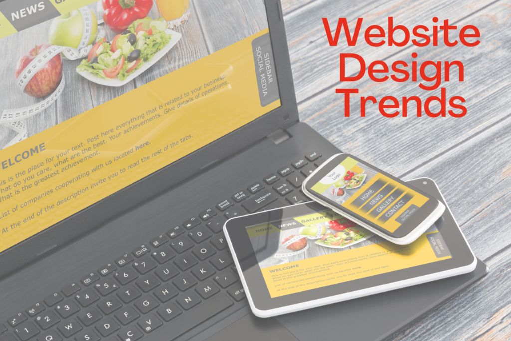
Website Design Trends in 2022
Web design has gone way beyond how it was about a decade ago. Gone are the days when many design-related elements were unessential on a website. With millions of people surfing the internet for new adventures daily, first design impressions matter; people are more focused on designs, how accessible the website is, easy navigation, and user-friendly. There are so many designs that are making waves already this year. Key features of these designs include unique typography, live animations, advanced interactions, and visual styles, to mention a few. We are halfway to 2023 already. So let’s look at the website designs that have been making waves so far in 2022. One-page Website The world keeps developing, and millions of people check different websites daily. A complex website can sometimes be the least effective because many people would find it hard to navigate. A one-page website makes it easy for everyone, especially if you have a narrow subject matter. A one-page website is similar to that. However, this fantastic design places all the necessary information on a single page, saving customers time and the stress of navigating different pages. Moreover, it gives a reader/viewer more focus because the information they seek is in front of their eyes. Side Scroll Website We are most familiar with websites that we can scroll and navigate vertically. However, this jaw-dropping design has made many people’ wow’ because of its horizontal scroll feature. This type of website design is common among portfolio websites and catalogs. Nowadays, almost every website with projects, galleries, and exploring new places can have a side-scroll feature addition; some top-rated music websites like SIareP is also side-scroll website. If done correctly, side-scroll websites are more attractive, engaging, and impressive. Sites of Delight This is more like a fun website. It has never resulted in a bad user experience. It comes in two forms. Surface Delight Deep Delight Surface delight is a great and compelling style. It is where animations, images, sound, and gestures come into play. However, to some point, it needs a bit of touch/assistance to stand firm thoroughly; that is where Deep delight comes into play. Deep delight ensures all customer requirements are met; this includes the website functions, how reliable it is, and how friendly and pleasurable it is. In designing a delightful site, the designers usually make a playful/fun UX design. They try to include humor in the navigations, menu, and other interactions. In addition, they often describe it as a website that works in unexpected ways. App-like Designs Many people are used to apps that easily interact, engage with a couple of animations, and have many dynamic experiences. Well, that app logic is in some websites already. Jeremy Beyth (CEO ThreeSixtyEight) recently spoke on this, stating, “An app-like website creates a more amazing experience, and if it’s given more attention, it will surely be the future of all web designs.” So many new web design tools like no-code make this interaction design easy to implement. Brutalism Design While the world fancy appealing fonts, and excellent placements, this design doesn’t seem to go with the flow. It is more like a sore thumb; it is raw, has an unpolished look, the colors clash, and the layouts look non-traditional. You need this if you are ready to settle for something bold and rugged on a website. Also, if this is the right taste, you wish to go crazy/wild on a website. What’s impressive about this design is how it makes your website pop out even with the little elements. Brutalist typography goes well on headers and paragraphs. It is an excellent way to add a metropolitan vibe to a website. Interactive Fonts In this design, there is more to text than just plain text. Professional designers have found many ways to make text move in fantastic styles, some by placing your cursor on the reader. A simple way to do this is if you apply a hover-state change similar to a button. It keeps getting easier to implement this feature through no-code platforms. However, when implementing this type of font, ensure it’s clear and readable because many individuals get puzzled by moving characters. Multilayer Design Do you have many contents you want to display in a limited space? This design got you covered. Over the years, many designers don’t want to approach designs with visual content. Still, with this technique, designers find it easy to populate a website with photo galleries and graphic elements. Imagery multilayers are an excellent technique to tell a story and make visitors spend more time exploring a website. Do you want your website to drive traffic as you’ve never imagined? Contact us now and have your website designed by professionals.