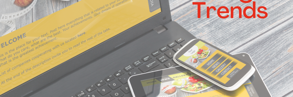
Web design has gone way beyond how it was about a decade ago. Gone are the days when many design-related elements were unessential on a website. With millions of people surfing the internet for new adventures daily, first design impressions matter; people are more focused on designs, how accessible the website is, easy navigation, and user-friendly.
There are so many designs that are making waves already this year. Key features of these designs include unique typography, live animations, advanced interactions, and visual styles, to mention a few.
We are halfway to 2023 already. So let’s look at the website designs that have been making waves so far in 2022.
One-page Website
The world keeps developing, and millions of people check different websites daily. A complex website can sometimes be the least effective because many people would find it hard to navigate. A one-page website makes it easy for everyone, especially if you have a narrow subject matter.
A one-page website is similar to that. However, this fantastic design places all the necessary information on a single page, saving customers time and the stress of navigating different pages. Moreover, it gives a reader/viewer more focus because the information they seek is in front of their eyes.
Side Scroll Website
We are most familiar with websites that we can scroll and navigate vertically. However, this jaw-dropping design has made many people’ wow’ because of its horizontal scroll feature.
This type of website design is common among portfolio websites and catalogs. Nowadays, almost every website with projects, galleries, and exploring new places can have a side-scroll feature addition; some top-rated music websites like SIareP is also side-scroll website. If done correctly, side-scroll websites are more attractive, engaging, and impressive.
Sites of Delight
This is more like a fun website. It has never resulted in a bad user experience. It comes in two forms.
- Surface Delight
- Deep Delight
Surface delight is a great and compelling style. It is where animations, images, sound, and gestures come into play. However, to some point, it needs a bit of touch/assistance to stand firm thoroughly; that is where Deep delight comes into play.
Deep delight ensures all customer requirements are met; this includes the website functions, how reliable it is, and how friendly and pleasurable it is.
In designing a delightful site, the designers usually make a playful/fun UX design. They try to include humor in the navigations, menu, and other interactions. In addition, they often describe it as a website that works in unexpected ways.
App-like Designs
Many people are used to apps that easily interact, engage with a couple of animations, and have many dynamic experiences. Well, that app logic is in some websites already. Jeremy Beyth (CEO ThreeSixtyEight) recently spoke on this, stating, “An app-like website creates a more amazing experience, and if it’s given more attention, it will surely be the future of all web designs.”
So many new web design tools like no-code make this interaction design easy to implement.
Brutalism Design
While the world fancy appealing fonts, and excellent placements, this design doesn’t seem to go with the flow. It is more like a sore thumb; it is raw, has an unpolished look, the colors clash, and the layouts look non-traditional. You need this if you are ready to settle for something bold and rugged on a website. Also, if this is the right taste, you wish to go crazy/wild on a website. What’s impressive about this design is how it makes your website pop out even with the little elements.
Brutalist typography goes well on headers and paragraphs. It is an excellent way to add a metropolitan vibe to a website.
Interactive Fonts
In this design, there is more to text than just plain text. Professional designers have found many ways to make text move in fantastic styles, some by placing your cursor on the reader. A simple way to do this is if you apply a hover-state change similar to a button. It keeps getting easier to implement this feature through no-code platforms.
However, when implementing this type of font, ensure it’s clear and readable because many individuals get puzzled by moving characters.
Multilayer Design
Do you have many contents you want to display in a limited space? This design got you covered. Over the years, many designers don’t want to approach designs with visual content. Still, with this technique, designers find it easy to populate a website with photo galleries and graphic elements.
Imagery multilayers are an excellent technique to tell a story and make visitors spend more time exploring a website.
Do you want your website to drive traffic as you’ve never imagined? Contact us now and have your website designed by professionals.


